Digitech Assessment - Develop a Digital Media Outcome
THE CURRENT SITE
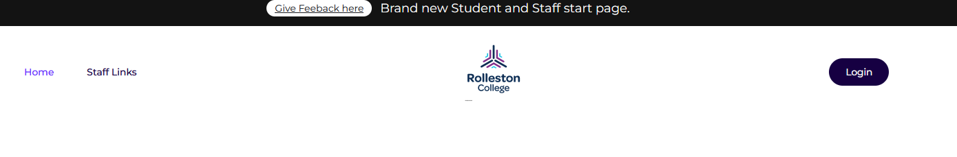
This is the current site, and the buttons are small. It is internal-only.
Some feedback I have heard about this site includes comments like "Why is it broken?" and that it is not used by the school anymore.
So, I decided to give it a new coat of paint and then work with Hamish (School IT Manager) to implement it throughout the school.
V1 – Getting a Basic Layout
I put together an initial design to get a base layout and gain an understanding of what is required for a clean start page.
It was important for me to get feedback at this stage, as it would help shape the way I build the site.
Feedback from Liam and Finn was that the design looked too clunky and did not feel “right.”
V2 Part 1 – Moving to Webflow and Testing
Here, I was experimenting with the size of the boxes. I decided to test Webflow to see if it was suitable for my designs.
Using the feedback I received on my previous design, I moved to Webflow, as it would let me focus on the design rather than the code.
Hamish pointed out something important for the site to be used successfully — people do not like scrolling. Mr Thew agreed with this.
While box size 3 seemed okay, some sizes didn’t look as good.
V2 Part 2 – Building a Template
Now that I understood how to use Webflow, I built this first version of the design.
Webflow was a bit cumbersome to work with, but I pushed through. I kept the rough square theme but added scrolling for access.
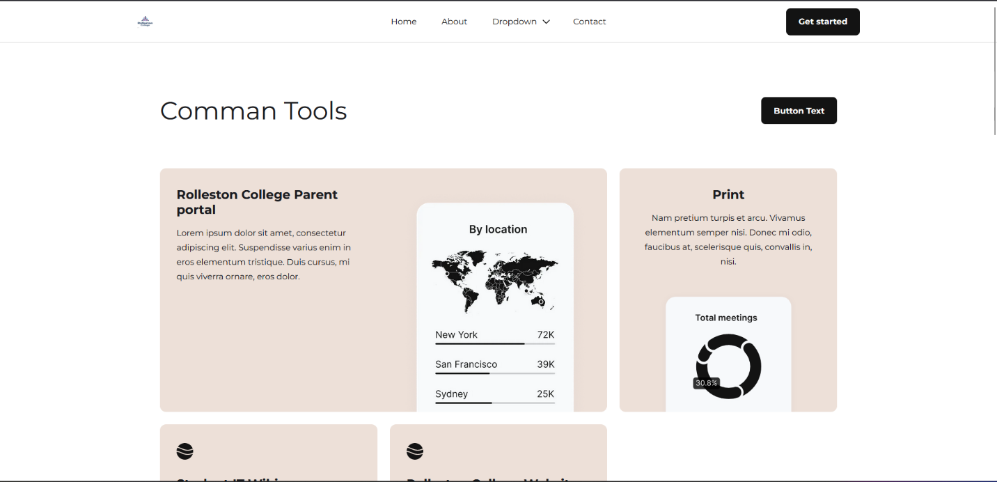
I made the big grid smaller based on feedback from Liam, Hamish, and Finn. However, even after making adjustments, they still felt the boxes were too big.
You can also see the nav bar here, which I later replaced as it did not look good.
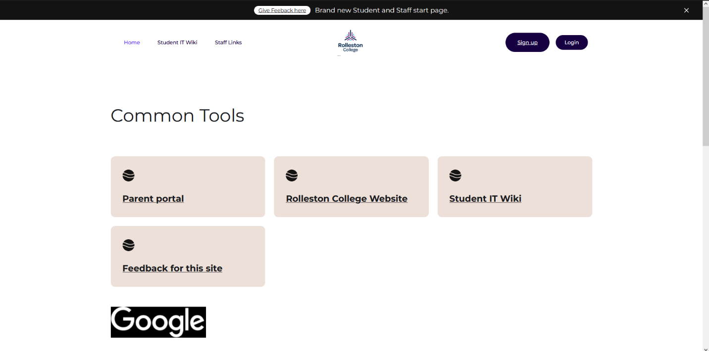
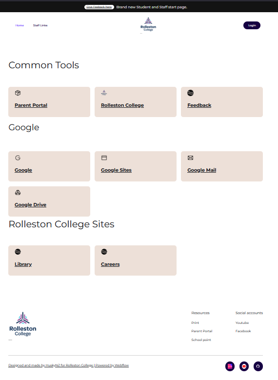
V2 Part 3 – Getting a Grid
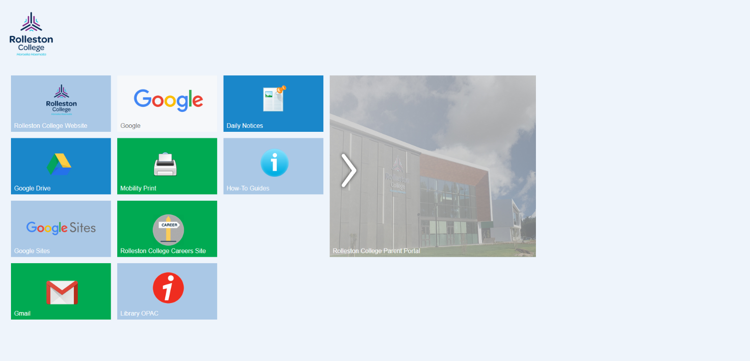
This was my first design with a banner and links to various sites. Feedback suggested the buttons were too big, but overall it looked good.
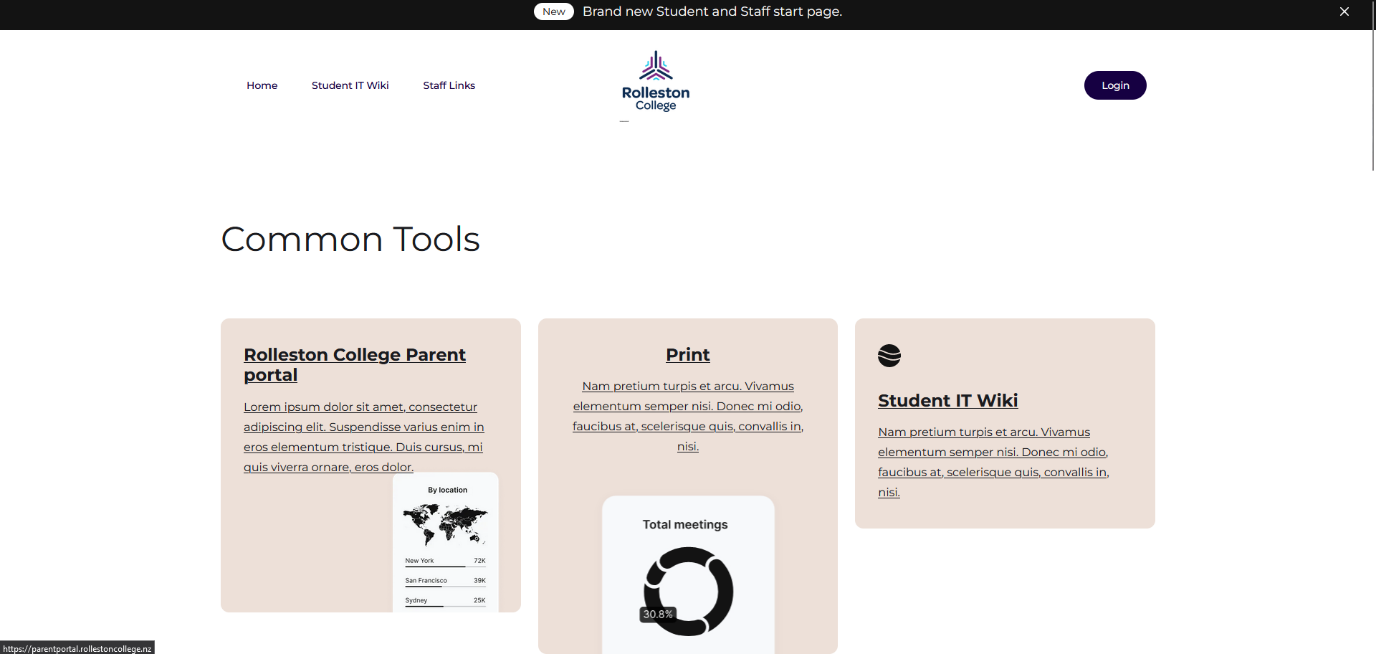
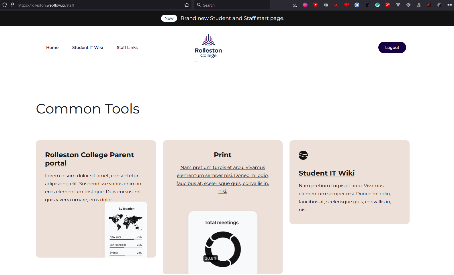
The login/logout system worked well — this allowed staff links to be hidden from students.
When logged out, the “Login” button is visible; when logged in, staff-only links appear.
V2 Part 4 – Adding a Signup Button
I added a sign-up button, but Finn felt it looked messy (“janky”). Liam also agreed it didn’t look right.
I removed it and moved the sign-up link to the login page.
V2 Part 5 – The Tab Experiment
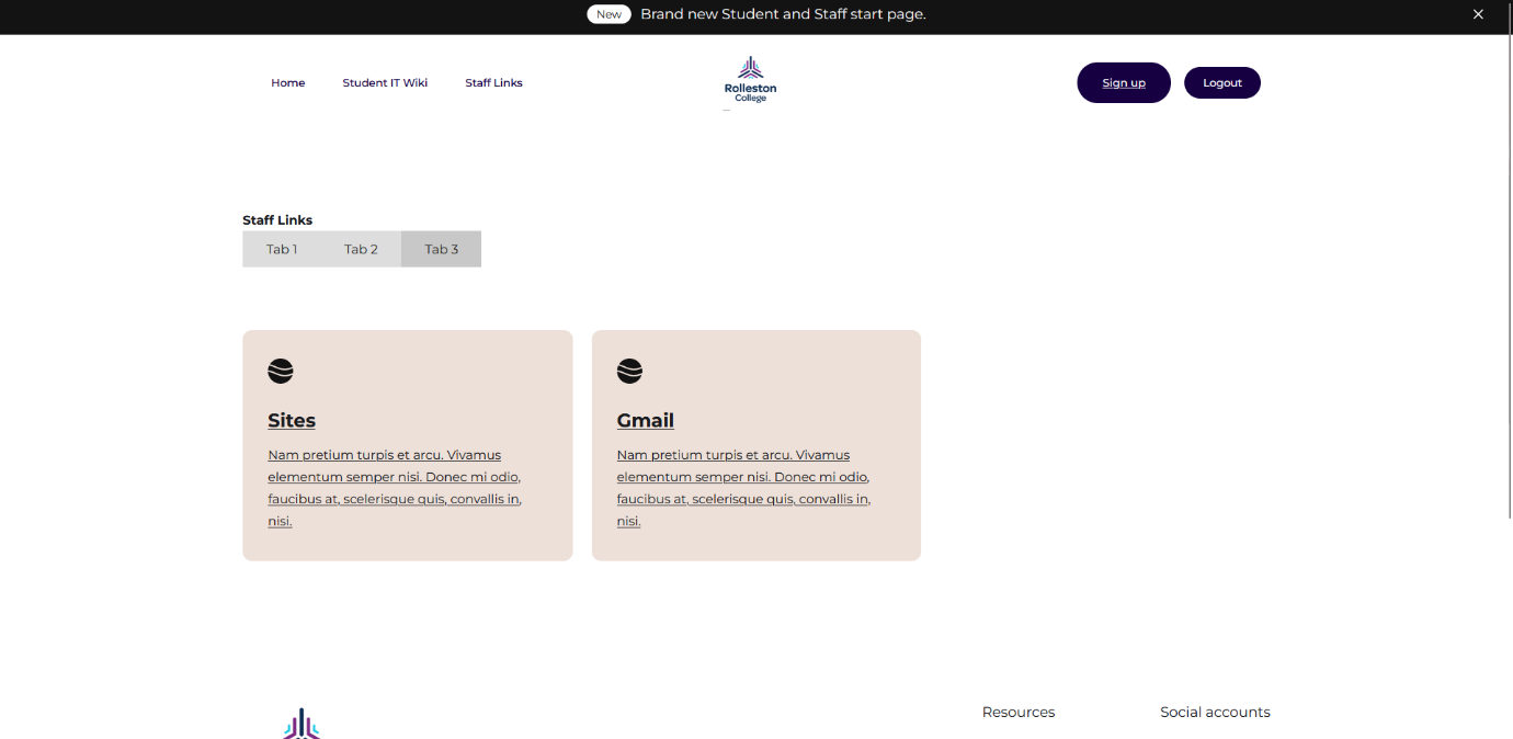
Since people don’t like scrolling, I experimented with using tabs.
However, this caused more issues than it solved and didn’t look right, so I abandoned it in favour of the grid design.
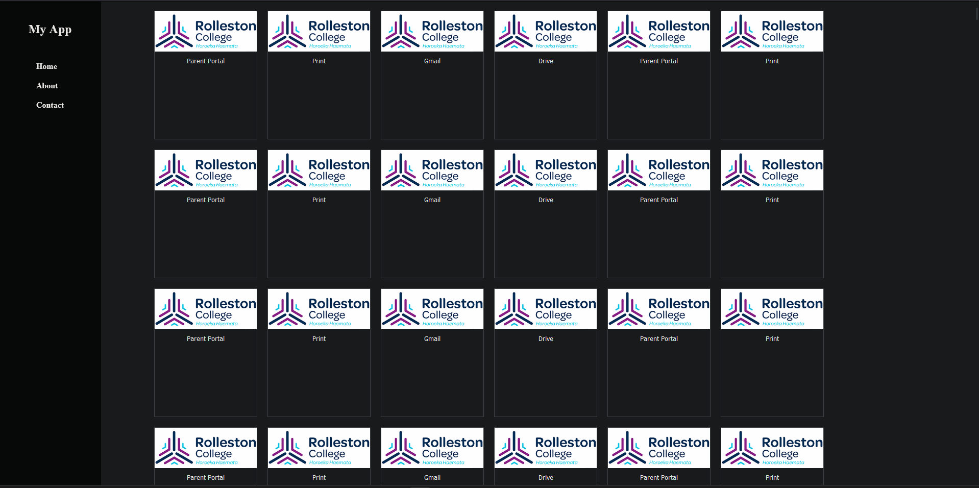
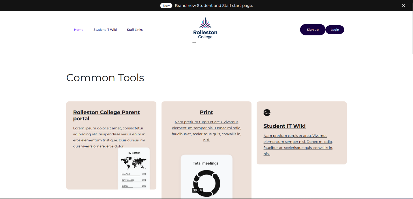
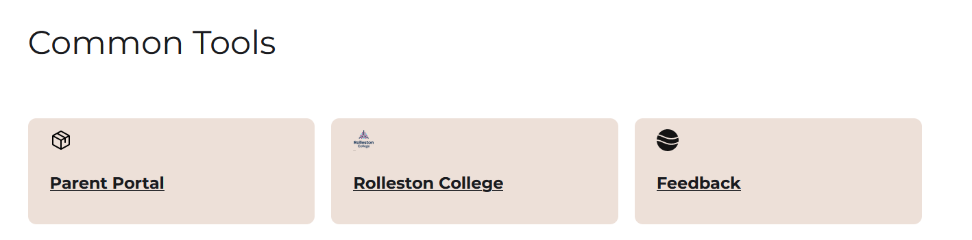
V2 Part 6 – Fixing the Boxes
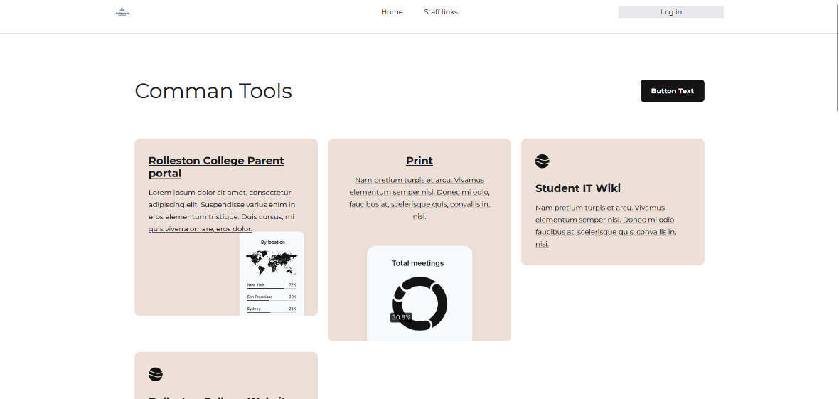
Based on feedback, I made the boxes smaller and improved the text by changing the font.
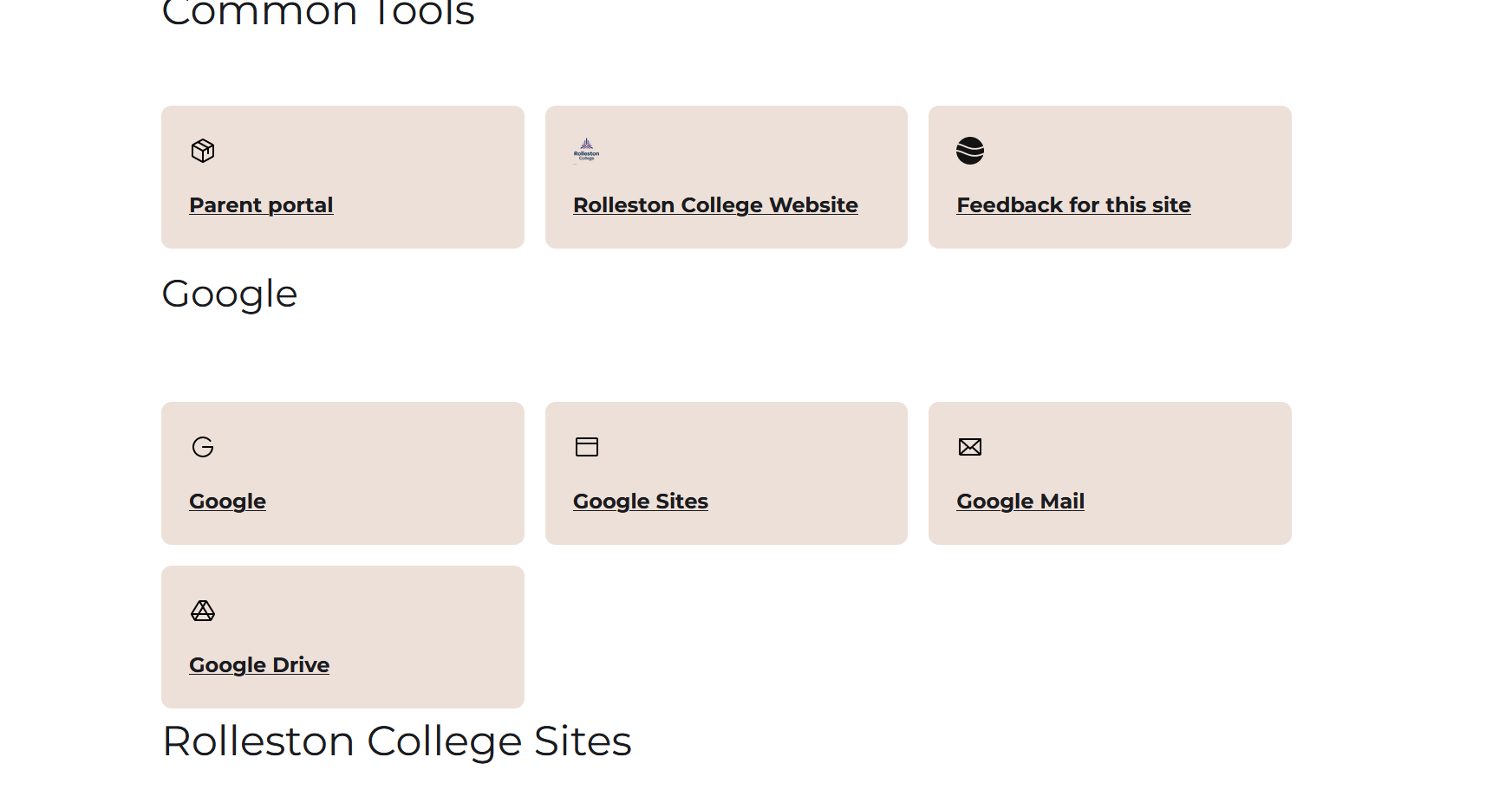
Liam and Finn also suggested removing the Student IT Wiki and fixing the Google logo.
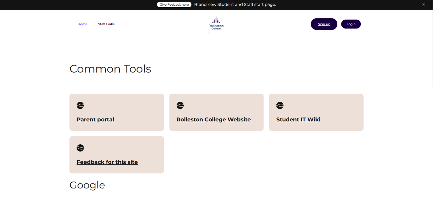
I removed the staff links, fixed the Google logo, and ended up with my “Final” V2 design.
The buttons are smaller, the layout is cleaner, and feedback from Liam, Hamish, and Finn was positive.
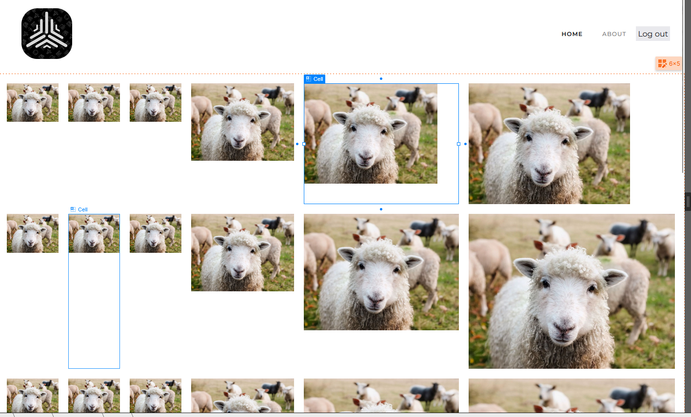
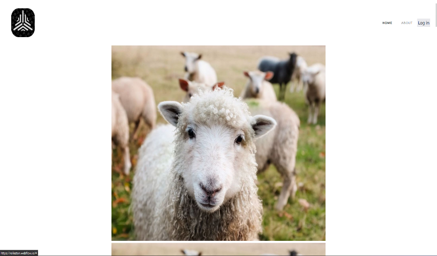
V2 Part 7 – Improving the Login Look
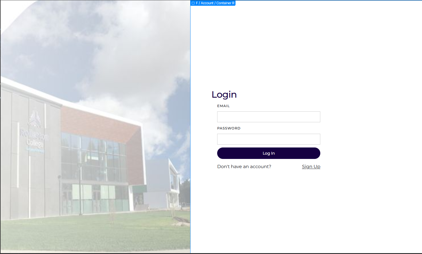
Finn suggested changing the login page image and mentioned the site should be in dark mode (outside the project scope).
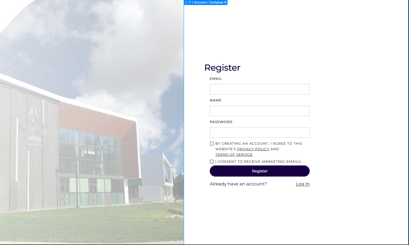
I also changed the sign-up page image following similar feedback.
I updated the icons based on Finn’s suggestions, and Zak suggested reducing the padding for better spacing.
Zak also suggested dark mode, which again is out of scope but inspired ideas for V3.
V2 Part 8 – The End of V2
This concludes V2. It was okay but not great — it still needed a lot of work.
I decided to invest my time into a V3 to address issues and make the site even better.
Relevant Implications
Functionality – A site is good when it looks nice, but without proper testing, things can fall apart quickly. Most testing was done by getting feedback and improving on it.
Aesthetics – Even if the site works, if it doesn’t look appealing, people won’t want to use it. I made sure to gather plenty of feedback to ensure it was not just based on my own opinion.
Feedback
Most feedback came from Hamish, who manages the current version of the site.
The process was: I made a change, and he gave his opinion on whether he liked it or not.
Tools
Based on feedback from Liam, Hamish, and Finn, my attempt to use Nuxt.js was unnecessary.
Webflow was the better choice — partly because of my student discount (free), but mainly because it was easier to work with.
I built the site twice, using two different tools. The first was in NuxtJS and CSS, but at the time, I was not skilled with frameworks. For my final version, I used Webflow as it was easier for both me and Hamish to edit when needed.
However, Webflow did have limitations, particularly in its design tools, which made it hard to get everything looking right.